Form Builder
A case study in detailed interaction design and usability testing.
Challenge
This design is for a product that aids higher education institutions in the process of becoming accredited. A large part of that process is gathering data to generate reports, and almost every kind of user in the system has reasons to build forms of one kind or another and collect data. When I was brought into this project, the design for form creation dated back ten years to the beginning of the application, and over the years many features had been added piecemeal leading to quite a mess. The form builder is central to the application, but the poor UX was causing the company to lose sales. It was my task to modernize the form builder and create an experience that helped our users build better forms so they could collect better data.
My Roles
- Determine strategic design direction for new form builder
- Gather requirements and user needs
- Concepting, sketching, wireframing
- Usability testing and multiple iterations
- Prototype the intricacies of new interactions
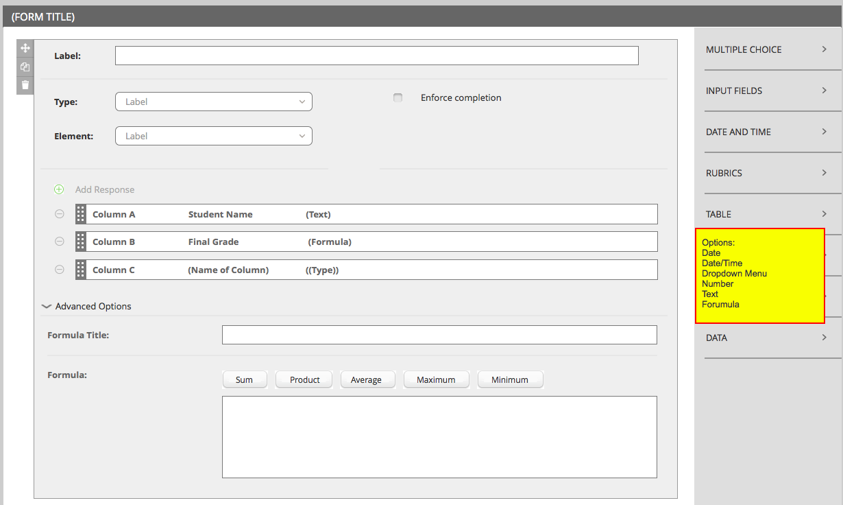
One of the more complex entry types this form builder had to accommodate.
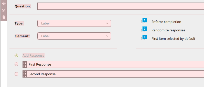
A multiple choice question being edited
Wireframe/Prototype
Master wireframe
(email mjennex@gmail.com for password)
Process
Planning and Research
I started this project by getting to know all the ins and outs of the old builder. I also talked to our users through a series of interviews, and reviewed the experiences of other form builders like Google Forms, Survey Monkey, and Qualtrics. Some pain points quickly began to emerge. For instance, users were often afraid they would mess something up when they edited forms. They knew what they wanted, but they didn't know how to put together what was in their head, and they were afraid to try for fear of breaking something.
Strategy and Design Direction
Addressing this pain point was the key to my redesign. When users build better forms, they get better data, but users can't build good forms if they’re scared to use the application. I wanted to turn that mindset into something more playful, and I wanted users to feel free to explore the builder. This led me to focus on a WYSIWYG style interface for form editing. The user could try different things and see the result immediately. If they decided they didn't like something it would be easy to change or undo. I wanted the user to feel empowered to experiment, and not be afraid to try something new, so the experience had to be forgiving.
Concepting, Sketching, and Wireframing
From this vision, the interactions, layouts, and visual assets of the form builder began to take shape; first on whiteboards, then in sketchbooks, then in Axure. Along the way I kept talking to users to make sure the design was fitting their needs, and we conducted weekly usability tests.
An early problem was organization of the different question types. Our system had many more entry types than applications like Google Forms, and organizing them as one long list was confusing to our users when we showed it in early sketches. To address this I held several card sorting activities with users to understand how they organized question types, and we used this data to iterate and test several UI presentations of question types until we found one that worked.
Usability Testing and Many... Many, Iterations
I put my earliest sketches in front of users as often as I could to gather their feedback. As the project became more refined, I began running more official usability tests with interactive Axure prototypes. These tests proved very enlightening, and many iterations were made on the design details. For example, our users were sometimes confused that the form they were seeing was a preview and not the actual form. One click on the form would cause an entry to get focus and go into an editing mode, but some users wouldn't even make that one click! To address this I added a hover state on form questions. This made it clear the user was in a builder, and even invited the user to click into editing more. The immediate result of this change was we stopped seeing this confusion in our usability tests.
Part of a prototype showing the hover state, and the way a large group of questions could be rearranged using drag and drop. If the animation doesn't show, click here to view.