Onsite Assessment
A page from the early conceptual wireframe.
Challenge
Doing proper education assessment requires gathering a lot of data, and sometimes that data needs to be gathered in the field. In education, student teachers are assessed directly while they are teaching, and that could be in a classroom, a gymnasium, or during a field trip. Many school districts have purchased tablet devices for teachers to use in these types of “in the field” situations, and the challenge of this design was to create an application to turn those tablets into another point of data collection for our larger system. What made this design particularly challenging was working with users unfamiliar with standard tablet interactions, in school districts where wireless internet might not be available.
My Roles
- Conduct user research and establish empathy with the target user group
- Maintain common mobile design principles while still designing for users not technically inclined
- Produce high level wireframes for refinement by visual designers
- Conduct usability tests and refine the design
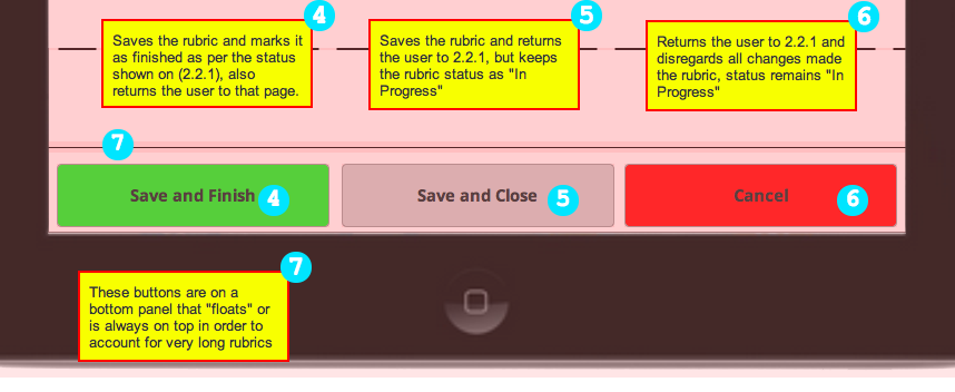
Wireframe/Prototype
My role in this project was mainly in the research and high-level design phases of this project. The wireframe for the project was used as a high-level communication tool with visual designers who were responsible for the product's final look. (email mjennex@gmail.com for password)
The footer of a form.
Process
Planning and Research
The genesis of this project occurred when customers requested a solution for onsite assessment, and the company acquired a code base to use for the problem. Thus UX was given an all too familiar design problem: "We have this new thing, figure out how we're going to use it!"
The technology I was working with was already set by the time the project started, but there was still a lot of flexibility in the form it would take. The business need was well understood, since it was part of a contract, but the user need was not. The first thing I did was talk to the people who would be using this app and find out how they did their job, and what tools best helped them get their work done.
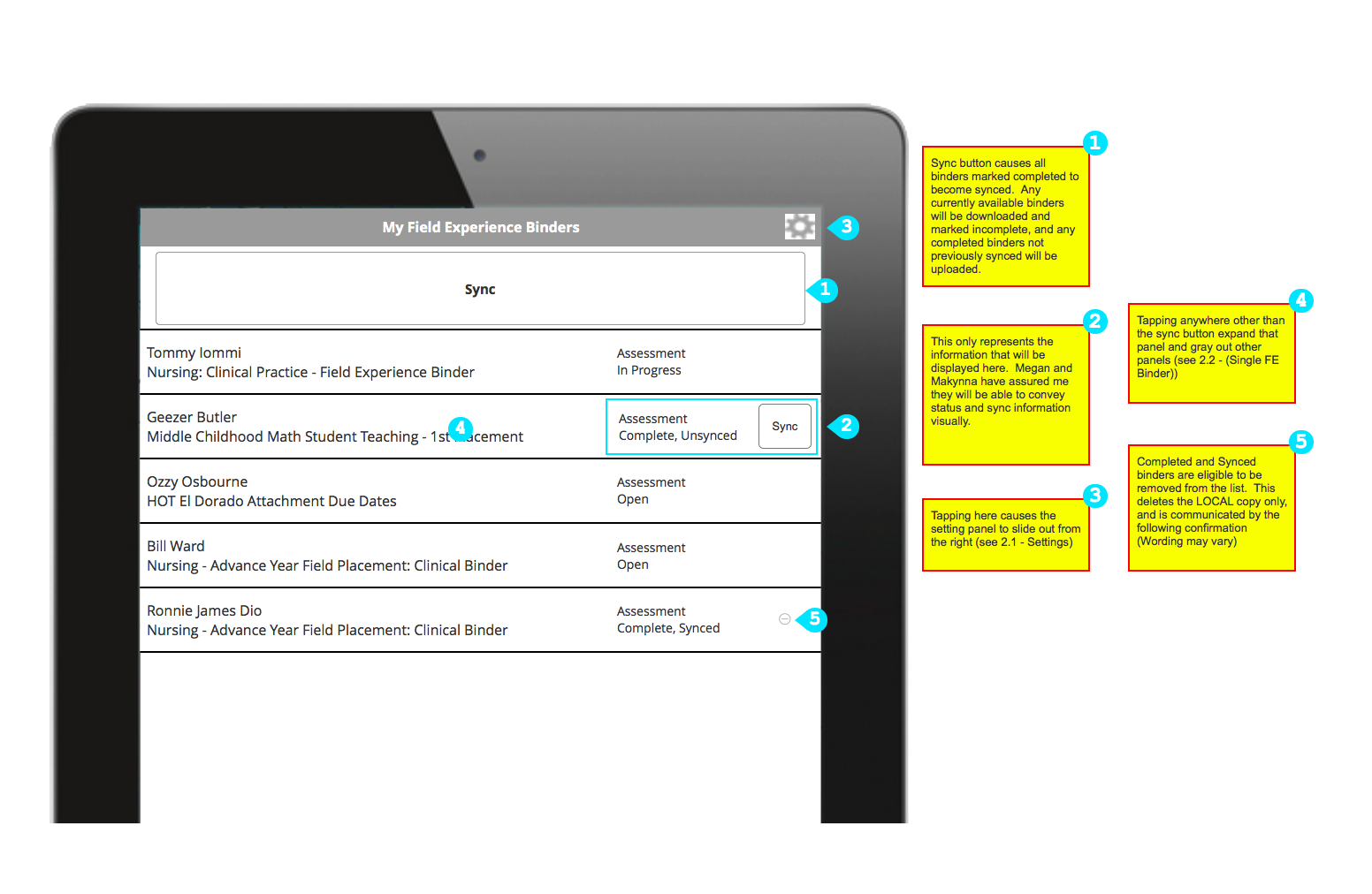
The Constraints: Connectivity, Familiarity, and Syncing
From my conversations with users, some key constraints emerged that defined the design:
- Connectivity is an issue. This app was supposed to be used in classrooms, and I expected wi-fi coverage at schools to be good, but I found this to not be the case. In fact, I was blown away by how often a K-12 school building wouldn't have wi-fi at all. The app would have to work with spotty to nonexistent internet connectivity.
- Familiarity with technology is highly variable. Some teachers I talked to were eager to try any new technology, but some barely used their computers at all and were resistant--and sometimes downright hostile--to new technology in their class. I learned that we could take very little for granted with respect to established interactions. Many of the users had never used a tablet before, and some didn't want to.
Combined, the previous two constraints illuminated a third constraint that would turn out to be the key to the design: How are we going to handle syncing of data? It had to be robust, able to freely switch between having and not having a connection, and it needed to be dirt simple with no chance for lost data. This inspired us to look at exemplars like Google Drive and Dropbox to design the syncing component. It also told us we would need to test extensively in order to make sure what we were designing would make sense to users.
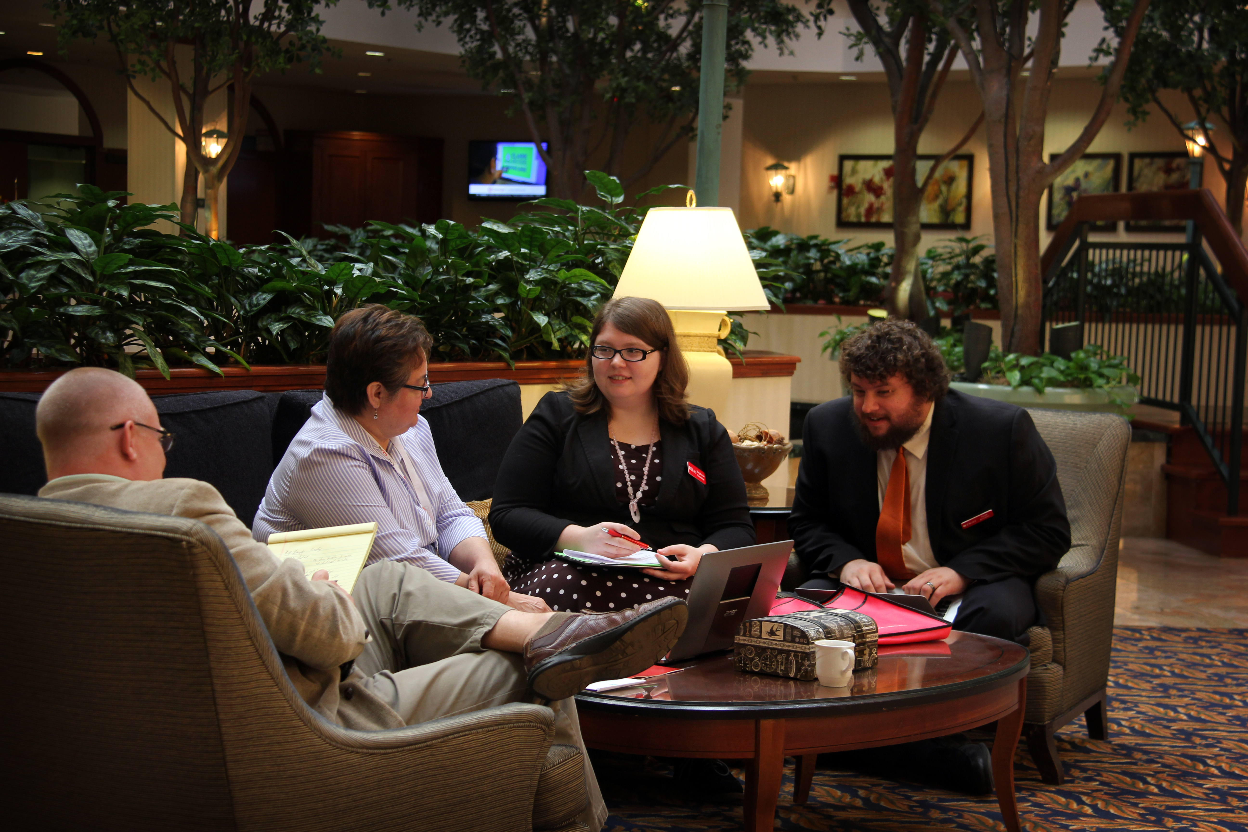
Conducting a usability test in a hotel lobby during a user training conference.
Usability Testing and Revision
The company held a customer conference just as I was completing the first set of design iterations. I headed over to the conference center and tested the design with as many people as I could find time for.
The syncing system tested well, and our users seemed to understand how to move their data between the tablet app and the main application. However, we had a multitude of usability failures on some basic interactions. I had relied too heavily on conventions of mobile interfaces under the assumption that "everyone knows how to do this." These assumptions tuned out wrong, and in a series of new iterations I simplified the the interface until we started to see positive results in future usability tests.