Redesign From Start to Finish
A case study in the UX of one entire large project from start to finish.
Overview
This is a project that I led from its first conception all the way through release and into post-release iteration and metrics. In this project are examples of essentially every UX skill possess, and I worked on it for around 18 months. When this project began, the company was a startup and I was proposing to redesign the most profitable, most widely used part of its business. By the time the project was released the startup and been acquired, and what began as a small project had considerably more resources behind it.
With so much time, resources, and effort, there's no way I could show everything. This case study isn't about every detail, it's about what the entire process looks like from a very high level. But that said, I love this project, and love answering questions about it! Email mjennex@gmail.com for questions, or to see detailed design specifications.
My Role
I served as the lead UX designer on this project. The tasks I undertook in that role included:
- High level research to define the problem, opportunities, value proposition, and basically outline why this was a project worth doing
- Concepting with stakeholders to determine a strategic direction for the solution, and validating those concepts with our users
- Realizing the exact design through the production of a detailed design specification, including tactical, data-driven research into how to handle various microinteractions
- Coordinating and guiding the project work of other designers in specific roles like visuals and copywriting
- Supporting the implementation of the design through quick resolutions to problems in development, and troubleshooting problems in front-end development
- Determining the success metrics for the project, implementing appropriate data tracking, and reporting on that data post-release to recommend and design incremental iterations
The product
This project was a redesign of a widget meant to show a schedule of bookable classes embedded on a client's webpage. At the time it began, the company was a small startup that used an API provided by another company providing business management software for the health and wellness industry (yoga, barre, pilates, etc). Our company used the bigger company's API to pull down class data and display it as web widgets a client could put on their website. The businesses could thus use our widgets on their websites to allow customers to view and book classes.
Defining and refining: Figuring out the exact nature of the problem
Kicking off: Initial research and my pitch to leadership
I started the project with a survey to gather data on our users’ pain points. Our clients mostly reported they were happy with the product, but one thing they had trouble with was customizing their widgets. At the time, all we offered were a few color options and a place to put in some custom CSS. For most users the colors were not enough, but the prospect of using CSS was too daunting. This widget lived on their website, and they wanted it to look like it belonged there, but it required a lot of work to get the widgets looking just how they wanted.
With a trove of user comments and statistics outlining this pain point, I brought my case to the product manager and CEO that we should focus on creating a new widget editor that addressed user pain points with customization. They agreed, and the next step would be to gather requirements; what kinds of customizations do users actually need to be able to do?

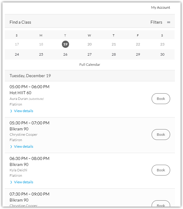
The new schedule widget at the small breakpoint. Responsiveness in the new widget was a huge improvement over the old, unresponsive widget.
Digging into the data: Analyzing our users' CSS to find patterns
Now I had to figure out what customization options the new editor should offer. After all, we had previously had an ability to just dump in custom CSS, and while that's not an elegant solution it does allow for anything to be edited. It was our users’ CSS though that would turn out to be an asset. Our database had entries of people's custom CSS solutions for their widget.
I pulled this data and wrote a Perl script that parsed it and generated statistics: How often are certain selectors used? Certain CSS classes? How often are specific values paired with specific properties? Properties with selectors?
Patterns emerged in the data. For instance, users found the layout too "squashed" and often tried to expand it. Around 70% of custom CSS users targeted the class used for a row in the table of bookings, and almost all of them targeted the padding-top and padding-bottom properties with a very small range of values.
It was amazing how much regularity there was in the data. Our users were applying the same kind of rules over and over again. As I dug through the data it began to separate into two piles: Things users do so frequently we should just make the widget like that by default, and things the users do frequently enough that we should provide it as a customization setting. As the first column grew, the first major revelation of the project happened, and the strategy shifted: Most of our clients’ customizations were not for branding, they were just trying to make the dated-looking widget appear more modern. So our strategy had to change. We couldn't just redesign the editor, we had to redesign the widget itself too.

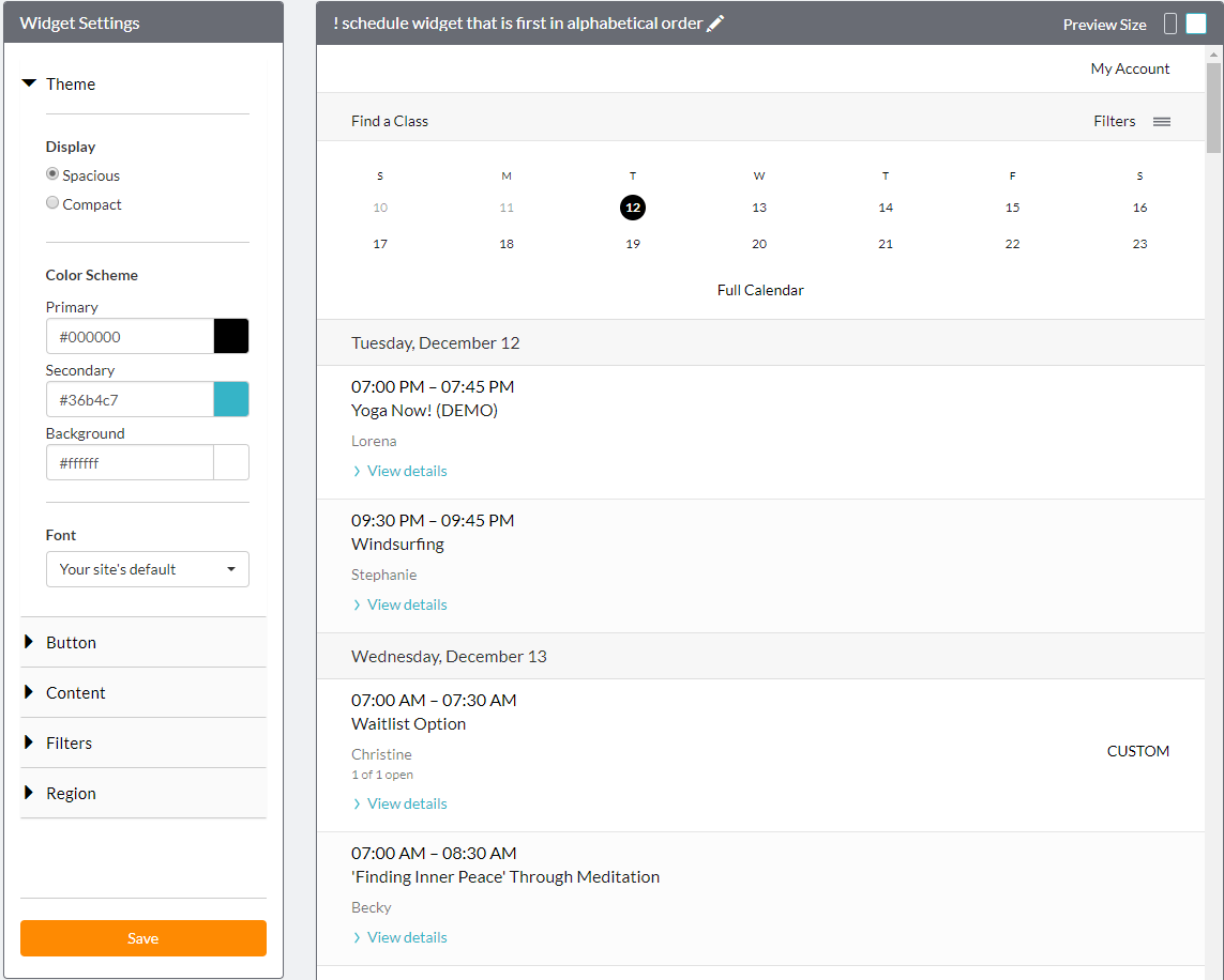
The new widget editor, allowing the widget to be customized and previewed in a WYSIWYG-style.

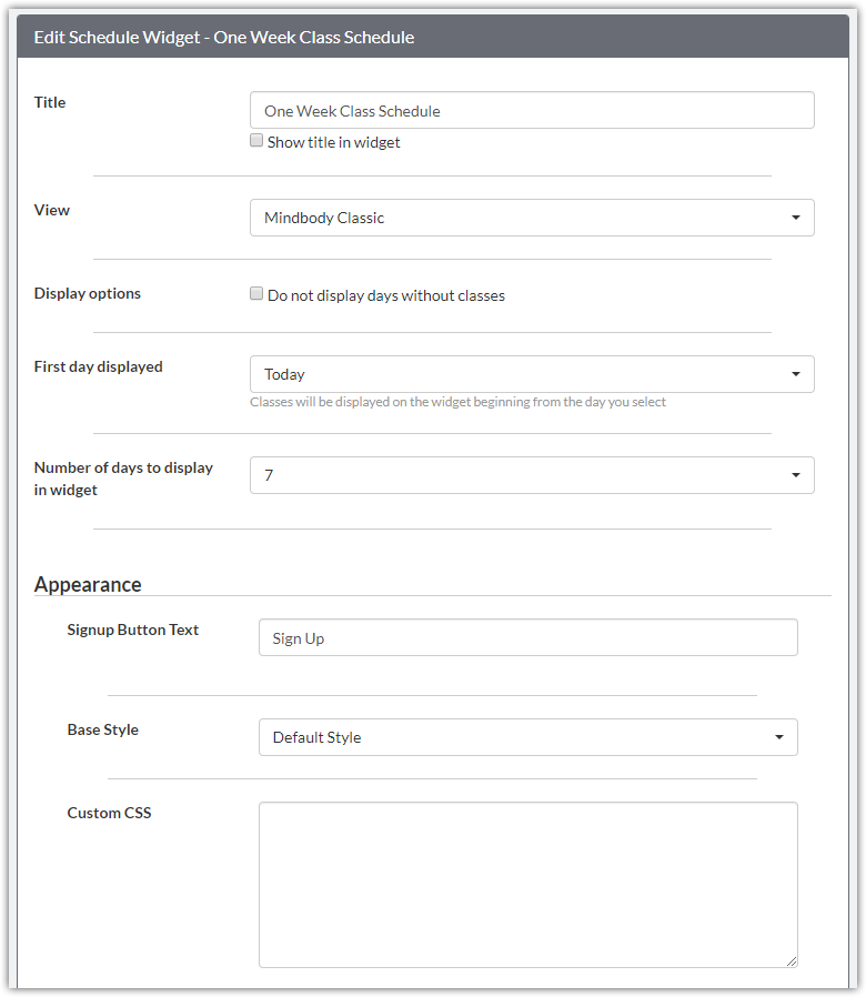
The old widget editor that was replaced, a series of form fields.
Pulling it all together: the redesign
The editor
The widget editor needed to be less like a long form or a setting page and follow a more what-you-see-is-what-you-get kind of pattern. Show the user their widget and let them play with it, encourage them to try things out, reassure them they won't break anything. At the same time, the editor had to hold quite a few options, meaning a lot of detailed information architecture was necessary to prevent information overload. I solved this problem by concentrating the settings in accordion-like "drawers" of which only one could be open at a time.
The migration and upgrade structure
We were not just going to throw a switch the day was released and turn all old widgets into new widgets. We knew we couldn't just change our client's websites without asking, so I had to design a workflow that delicately guided users to upgrade their widget. We knew many users would be averse to change for its own sake, but we knew we had a better product offering. I designed the upgrade flow to put the new widget in front of users as early as possible, before the upgrade was complete, and let it "speak for itself.” At the same time I provided ways to go back to the old widget so that users’ understood they were in control, and upgrading was their decision.
The widget
When it came to redesigning the widget proper, I has more of a supervisory role. I provided a list of the most common CSS alterations as a starting point for the ways in which users already modernized the old widget, and much of the detail work here was done by visual designer assigned to the project, while I provided functional requirements and resolved issues with the design.
Measuring success
The success of the redesign hinged on two key performance indicators. The first was rate of adoption, or the percentage of new widgets of all widgets, this told us if users were pleased with the widget and accepting the upgrade. The second was conversion rate, or the percentage of end-users loading the widget who went on click on a booking button, if we truly improved the design then the new widget would convert at a higher rate than the old one. In order to ensure the design was delivering on its promises, I had to set up the necessary analytic hooks and monitor the resulting data to report on.
Implementation and release
I held regular stakeholder reviews throughout the principal design phase, processing feedback and producing new iterations. Many issues that could have been much bigger problems were caught and corrected at these sessions, and by the time dev work began there were relatively no surprises. During development my role was to provide support to the developers, as things are built there are always some late problems that crop up. With this project they were quite few and minor, but there were a number of instances where I had to quickly redesign small interactions due to unforeseen development constraints.
This is a part of the process I really enjoy, the focus of the issues and the constraints of time always excite me. As development winded down my role changed to help with quality assurance, as I spent my time testing the visuals and interactions
Monitoring: How do we know we were successful?
Post release, I was responsible for reporting on the data for our key performance indicators, as well as analyzing feedback and suggesting post-release iterations. So far the project KPIs have been strong, with an upgrade rate that puts us on track to have full adoption within the first year of release, and an conversion rate three percent better than the old widget. I prepared the KPI and feedback reports at 3 and 6 months, and have designed a few small iterations at both intervals.. So far this project has been a huge success, and the increased bookings for our clients is something I'm extremely proud of!